
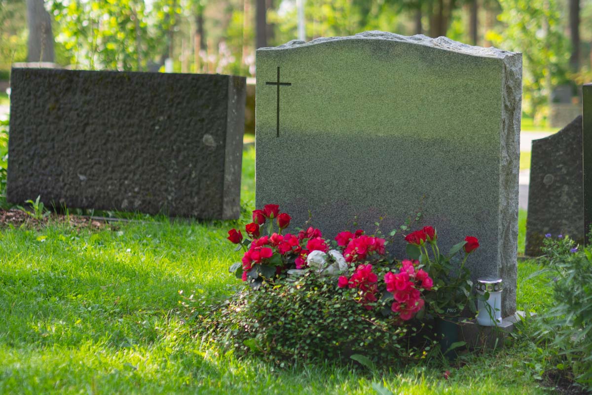
Selecting a granite colour for a memorial is a thoughtful decision that brings together practical considerations and personal meaning. The right choice can help lettering remain clear, complement the cemetery setting, and reflect the person being remembered. There is no single best colour for every family, but understanding how granite performs over time can make the process feel more manageable.
Start With Cemetery Guidelines and the Memorial Setting
Before settling on a granite colour, it is helpful to confirm the cemetery's requirements. Some cemeteries have guidelines about monument styles, dimensions, finishes, or permitted colours, particularly in sections where a consistent appearance has been established. Asking these questions early can prevent disappointment later and narrow the selection to suitable options.
The surrounding setting also matters. A memorial in a bright, open area of a Vancouver cemetery may look different throughout the day than one placed beneath mature trees. Dark granite can create a strong, formal presence, while lighter shades may blend more softly with natural surroundings. Seasonal changes in rain, cloud cover, and vegetation can also affect how a colour appears.
Families considering custom memorial options can explore how granite colour works alongside shape, finish, inscription placement, and personal design details. Looking at these elements together often gives a clearer picture than choosing a stone sample on its own.
Granite is a natural material, so colour is not perfectly uniform from one piece to another. Mineral patterns, flecks, and movement within the stone are part of its character. A sample is useful for understanding the general tone, but the finished memorial will have its own natural variation.
Choose Contrast That Supports Clear Lettering for Years to Come
A memorial inscription should be easy to read not only on the day it is installed, but through changing weather and many years of visits. Granite colour and lettering treatment work together to create that readability. The strongest visual result usually comes from clear contrast between the stone surface and the engraved or applied lettering.
On darker granite, polished surfaces can provide a deep background that makes carved lettering stand out, especially when the inscription has been enhanced with a contrasting finish. Dark colours such as black, charcoal, or deep red can offer a traditional appearance while allowing names and dates to remain prominent. On lighter granite, lettering may need a different approach to ensure it remains visible from a comfortable viewing distance.
Finish affects contrast as well. A polished face reflects light and can make the granite's colour appear richer, while a frosted or textured finish changes how the surface catches the eye. In direct sunlight, glare can sometimes affect readability, particularly on highly polished dark stone. In shaded conditions, a subtle inscription may be harder to see if the contrast is too low.
This is why it is worth considering the monument as a complete design rather than focusing only on colour. The proportions of the stone, the size of the lettering, and the amount of information included all influence clarity. Families reviewing upright granite monuments can see why vertical surfaces often create room for an inscription that is balanced, legible, and respectfully arranged.
A restrained design is often easier to read. Generous spacing and appropriately sized lettering can give each name and message the attention it deserves.
Balance Personal Meaning With Granite's Natural Character
Granite colours can carry personal associations. A family may feel drawn to a particular shade because it reflects a loved one's personality, favourite landscape, heritage, or the colours that appeared in their home or garden. Those connections are meaningful, and they can be an important part of creating a memorial that feels sincere.
Some families prefer the classic depth of black granite. Others are drawn to warm browns, greys, reds, or blues that offer a gentler or more distinctive expression. A lighter stone can feel calm and understated, while a richly coloured granite may make the memorial more visually expressive. Neither approach is more meaningful than the other.
If the memorial will be placed beside an existing family monument, matching or complementing that stone deserves careful attention. An exact match may not always be possible, particularly if the original monument was installed many years ago or came from a different granite source. Still, a similar tone, finish, and overall visual weight can help create a cohesive family plot.
Personal artwork may also influence the colour decision. Detailed scenes, portraits, floral designs, and symbols can look different depending on the granite background and the treatment used to create them. Hand-etched artwork can add a personal visual element, and its visibility should be considered alongside the inscription rather than as an afterthought.
Take time to view granite samples under more than one lighting condition when possible. Indoor lighting may make a stone appear warmer or darker than it will look outdoors. Natural daylight, overcast skies, and low-angle afternoon sun each reveal different qualities in the granite.
Review the Proof Carefully Before Moving Forward in Vancouver
Once the granite colour and design direction are chosen, the proofing stage gives families an important opportunity to slow down and review the complete memorial. A proof should be read for spelling, dates, punctuation, layout, and the placement of any artwork or meaningful wording. It is also the time to confirm that the selected granite and lettering treatment support the level of contrast you want.
Reading an inscription aloud can help catch details that are easy to miss on a screen or printed page. It can also help a family consider the emotional rhythm of a phrase, verse, or tribute. A few well-chosen words often have lasting impact when they are given enough space to be seen clearly.
For families in Vancouver, British Columbia, choosing granite is often both a practical and emotional step in the memorial process. Rain, changing light, and regular outdoor exposure make long-term readability especially worth considering. Granite is valued for its durability, but thoughtful colour, finish, and inscription choices help preserve the memorial's visual clarity over time.
There is no need to rush toward the darkest, lightest, or most elaborate option. The most fitting memorial is one that meets cemetery guidelines, remains readable, respects the family setting, and feels true to the person being honoured.
If you are ready to discuss colour samples, lettering contrast, or a memorial design that reflects your family's wishes, you can request a quote and begin the conversation at a comfortable pace.


